Does your logo speak for itself?
Designing a logo is simple, right? Think again. There’s more to developing a brand’s identity than just placing a name in a circle and calling it done. Logos are about first impressions and can influence a buyer’s decision or attitude towards your business’s overall feeling. A first impression goes a long way.
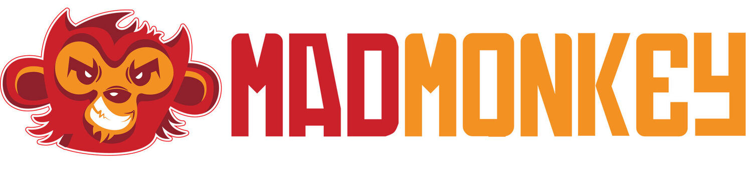
Sometimes you’ve got a logo, but it just needs a simple up-to-date facelift. Or other times, being the brand owner makes you just too close to be creative. That’s where Mad Monkey can help. With over 20 years is sign design experience, we’ve seen our share of some awesome and pretty awful logos. Here are a few quick tips to get the creative juices flowing.
“Whatever it is, the
way you tell your
story can make all
the difference.”


Tips for Great Logo Design
Be Unique & Clever
Every logo has a story to tell. The point of a logo is to tell your business’s story by being unique, distinguishing your brand from a competitor’s. It’s important to create be clever with the logo creation. It might be tempting to snag an icon from a Google image search, but that is never a good idea. It’s important to put thought into the business name, its industry, and its audience, as these are the key pieces of the pie to create a memorable logo.
Understanding Your Actual Brand
Every brand has a personality. Take our little Mad Monkey. He’s mad but definitely not angry or mean. He’s crazy, super obsessed with being creative, and a little bit naughty when he gets to go outside of the box.
That little monkey is our brand. He represents how the company as a whole feels about the industry we’re in. That’s what your brand needs to do. Showcase how the company feels about the industry they are in.
Whatever is decided on for your brand, it must make sense for the brand as a whole. Keep questions to keep in mind are:
What does the customer care about?
Should your brand evoke emotion?
If so, what emotion is that?
Is it fun and unconventional or contemporary and straight-forward?
Appropriate Color Choices
Ultimately, your choice of color has many influences based on your audience and your industry’s products/service. If you are an arborist,n use a green palette to represent trees instead of a blue palette that does not.
Colors have the innate power to evoke feelings and emotions, so their corresponding colors are essential. Every color evokes a different emotion that can impact your brand logo. Here’s a quick break-down:
Red: energetic, sexy, bold
Orange: creative, friendly, youthful
Yellow: sunny, inventive, optimism
Green: growth, organic, instructional
Blue: professional, medical, tranquil, trustworthy
Purple: spiritual, wise, evocative
Black: credible and powerful
White: simple, clean, pure
Pink: fun and flirty
Brown: rural, historical, steady
Logotypes
Logotype. Sometimes a little symbol or illustrated character like our little Mad Monkey isn’t always necessary. Sometimes all that is needed is just a logotype only. Think Coca-Cola.
They don’t have a symbol, just a logotype, and that’s it. If you have a generic name, then you’ll want to create a logotype that isn’t just Arial font type. Try to be as unique as possible while utilizing a standard font type.
Keep it Easy & Flexible
You’ll want whatever your brand logo is to be flexible. To be able to fit in horizontal spaces and vertical spaces. Sometimes you’ll need to have different versions of your logo to allow for this type of flexibility.
Also, you should always, always have a full color and 1-color version of your logo available. 1-color logos are great for tee-shirts, hats, and promotional giveaways. So, keep in mind your logo will need to be utilized in different ways.